Our Rebranding Strategy – How We Are Reinventing Our Brand
A rebranding strategy should be well thought out. I’m sharing our reasons for rebranding, and what you need to consider before you do too!
Quick Links:
- TIP: How to create a rebranding strategy [Infographic Download]
- Episode Overview – How to Brand Your Business | Changing my Hair Color to Match my Business?! + Branding Strategy Tips
- Personal Note from Jenn Neal on Rebranding Strategies
- Episode audio [Podcast on Spotify]
- Blog Post – Our Rebranding Strategy – How We Are Reinventing Our Brand
- Related Posts

TIP: How to create a rebranding strategy.
Time needed: 5 minutes
TIP: Rebranding a Business Strategy: Step by Step With Example
- Research
Is a rebrand necessary? Align company positioning and messaging with fonts and colors that cater to your target audience.
For us – we were close, but missing on color and font so it felt important to do. - Solidify
Determine a full or partial rebrand and establish the messaging and look that aligns with targets and values based on your research.
For us – we had to decide to kill the purple and get stricter about our fonts. - Integrate
Decide what assets (logo, website, cards, social media, etc.) that needs to be rebranded and prioritize the projects.
For us – we started with colors and program logos then new look for YouTube and social media. The looks determined there will be the basis for the rest of the rebranding changes. - Promote
Choose how you will roll out your rebrand – a bit at a time will help to not confuse customers and make them feel like part of the process.
For us – we started with the podcast and social to announce our rebrand and then we’ll roll out a new website and new marketing materials.
What’s In This Episode
When thinking of branding colors for my business, it was a no brainer for me to add purple as one of the main colors. (Even my hair is purple!) Now, after nearly 15 years in business, I realized that our branding has kind of been an epic fail. Join me as I walk through our rebranding strategy, the reasons why and using my business as an example.

Jenn Neal on Rebranding Strategies
Several times, I’ve had people ask if I do VA services because I have the word virtual in my name. That’s when I realized that the messaging for our brand was all wrong!
-Jenn Neal

Our Rebranding Strategy – How We Are Reinventing Our Brand
Rebranding your business is no easy feat. It takes a lot of time, research, and effort to get everything right. My business colors for Formula Done have always been purple and green. I even incorporated our colors into my look and have had purple hair for close to 15 years now.
However, after almost 15 years in business, I’ve come to realize that our branding was steering people away instead of drawing them in! It only took the universe knocking at my door 3 times for me to listen. Well, let me be honest – I’m attached to purple and I don’t want to get rid of my signature purple hair. But after one of Katheryn Jones’ sunroom sessions, I knew that it was time to rebrand my business and ultimately steer away from the purple.
Rebranding Background
You may be wondering what brought me to decide to rebrand after so long. Well, there are a lot of reasons a company may decide to rebrand. But it’s not a decision to make overnight. There needs to be a purpose behind it. Like a really good reason. Trust me, businesses do not rebrand for fun!
In my case, this has been in the making for a few years. First, it was a name change. My old company name was Kane and Associates, but it sounded too much like a law firm. And so, Formula Done was born. Recently, a friend had given me a branding personality quiz and the results I got didn’t match up with my branding. But still, I chose to unsee it for a while. Fast forward to Katherine Jones’ Sunroom Session I recently attended, and I felt like I was slapped across the face.
The Harsh Reality
What was SO drastic that could have happened? I’m glad you asked. In this small mastermind of about 12 people, we were given a roundtable task to pass around a notebook with our company name, and a few other things about our business. These notebooks were passed around the room. We then searched for what we thought the logo and color scheme for each company looked like from this basic information.
When I received my notebook with feedback, I was shocked! No one picked any swirly fonts or bright colors. It was nothing like my current branding. Everyone had expected to see dark tones, bold fonts, strong lines, and movement. Not one person picked anything with purple – yet here I was, the only one with purple hair in the room, thinking that I am known FOR my purple hair. (They didn’t get the hint.)
But, for the third time, I was faced with reality. The universe came knocking and made me realize that my branding is not quite right. I knew it was time to look into the dos and don’ts of rebranding. So I grabbed my computer and started my research.
Rebranding Strategy Research
Rebranding your business takes a lot of research. Diving into this, I researched color psychology and font psychology. I looked into which colors worked well for my avatar. Were there colors I shouldn’t use even though I cater my business to both men and women clients? I wanted to know what kind of fonts would stand out better. Was it okay to use soft fonts or should I use a bolder font? What type of elements should I have in my branding? Should there be textures and definitive lines, soft lines and no texture, movement, or no movement? Or is there a way to make a magic combination of different elements that would work best?
Color Scheme
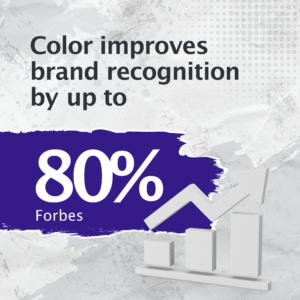
For one, when creating a color scheme for your company, it’s important to research what colors appeal to different kinds of people. Take into consideration your target audience. I’m sure you’ve already built your ideal client, or avatar if you will. Is your avatar a female, or male? Or will you be catering to both genders? If you want to cater to both genders, look into what colors will be appealing to both men and women. It’s important to keep your audience and their preferences in mind when creating a color scheme. You want them to feel attracted to your brand. (Just a fun fact: being that men have 1 chromosome and women have 2, we see colors differently. Men tend to lean towards darker colors because they can see them better. Crazy, right?)
Your brand colors should represent not only you but your clientele. You can ultimately be weakening your brand instead of building it by introducing too much color. That’s exactly what we had done over the years – brought in too much color. In the process of picking a new color scheme, my team and I didn’t only focus on the data. We also looked at color meaning and color emotions. We focused our efforts on relaying a message through our colors. How did these new colors match up with our core values and what do our prospects expect to see and feel when they see our brand?
Our Rebranding Preference
Ultimately, we shied away from our signature purple. In turn, we decided to skew toward a more male-focused brand, but with colors that still appeal to women as well. The color scheme we developed leans on primary colors – Blue, red, and green as well as black and gray – that are saturated, deep, and rich in tone. We decided to keep our main color a deep, rich blue that is dark enough to lean on some purple tones (You didn’t think I’d be able to give up the purple entirely, did you?!).
The Content Toolbox (our podcast) is now a very luxurious red, and our product, Content Activation, is deep green derived from British Racing Green (because of Formula One racing of course!). These colors are accented by black and gray, with monochromatic elements that play into the movement and my love of racing. Stacked next to each other, these colors made our brand feel powerful, yet still true to who we are.
If your color scheme is appealing, yet still true to you and your brand, you’re on the right track.
Fonts, Logos, and Lines
Your logo is one of the most important aspects of your business. Think of your logo as a reflection of yourself. What do you want to convey to your audience when they see your logo? Do you want to have a soft or bold look? Should there be movement?
When creating your logo, take into consideration the feel of your brand. If you want to convey power and boldness, you do not want any swirly, soft fonts. You’ll want to stick to bold fonts and sharp lines. If you’d like to tone it down a bit, lean more toward softer fonts, or even a font with a bit of curl to it.
After doing my research, I realized that it was best to keep a logo with bold, strong lines. My team and I all agreed that we still love our current Formula Done logo. It was strong and bold, with the right amount of movement around it. (It just needed some fresh colors).
Once you have your logo down, you start to rework graphics and other elements of photos and your website to emulate the feel you’re going toward.
The Almost Finished Product
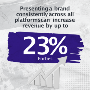
Sometimes, a brand change just includes logos and colors. Other times, rebranding strategies will include things like a name change as well, like a complete overhaul. (Our rebranding strategy did include a shift in our name as well! For more on that, take a look at our video!) The last pieces to the puzzle, and where we are headed right now, are ensuring that all of our elements now match. We are finding our theme, reworking our graphics for social posts, and heading toward a complete overhaul of our website to ensure a continuous flow through all of our platforms.
A word from the wise – regardless of your choice to rebrand or not, be sure that you are proud of your brand. Your brand is an extension of you. Be sure that it still holds to your values and who you are. Check out more of our content (and see the visible changes in our brand!) by checking out our blog!
Related Posts
What is Rebranding? 6 Best Rebranding Examples & 4 Top Strategies
The Dos and Don’ts of a Rebranding Strategy
Brand Color Psychology: Men vs. Women
How to Reinvent Your Digital Marketing Strategy
How did you decide on the different elements of your brand?